Every South African has fond memories of the beloved childhood favorite, Chip n Dip. While we've all grown up, the brand has remained stuck in the past. Imagine if this nostalgic classic were given a fresh, modern makeover.
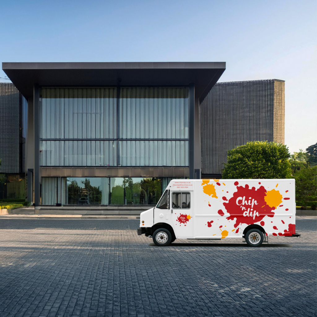
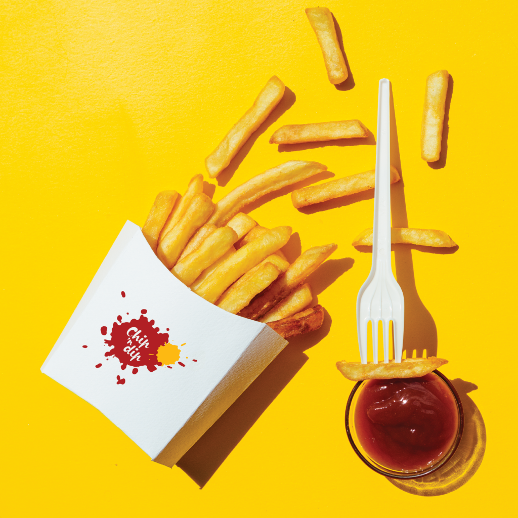
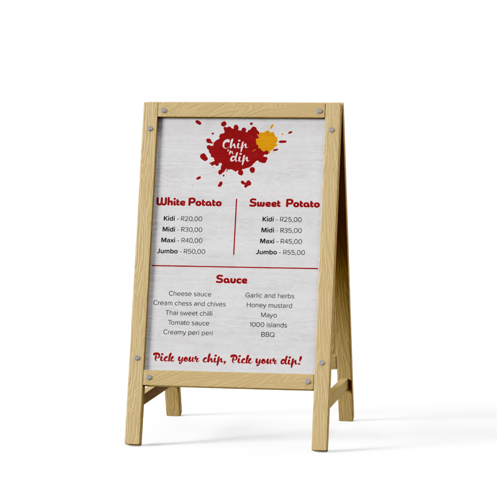
This project aimed to breathe new life into a classic brand favorite by adopting a simple yet effective color palette of red, yellow, and white. The branding elements were clean and minimalistic, yet infused with a fun, organic feel that makes the brand approachable and suitable for casual settings.
In applying these elements across the brand, I ensured consistency by keeping all backgrounds white and using the logo as the primary decorative feature. This approach resulted in a clean, concise look that maintains a sense of fun.
While the branding may not be groundbreaking in its minimalistic approach, which reflects current trends, it successfully balances simplicity with playfulness. A standout feature of this project is the decision to use packaging made from leftover potato skins, adding a socially conscious element that resonates with modern consumers and enhances the brand’s appeal in today’s marketplace.